Tim & Luuk will be discussing all the product updates that we brought to Contrast in the last month.
Today, at 16:00 CEST on this link
👋 Your friends at Contrast


Tim & Luuk will be discussing all the product updates that we brought to Contrast in the last month.
Today, at 16:00 CEST on this link
👋 Your friends at Contrast

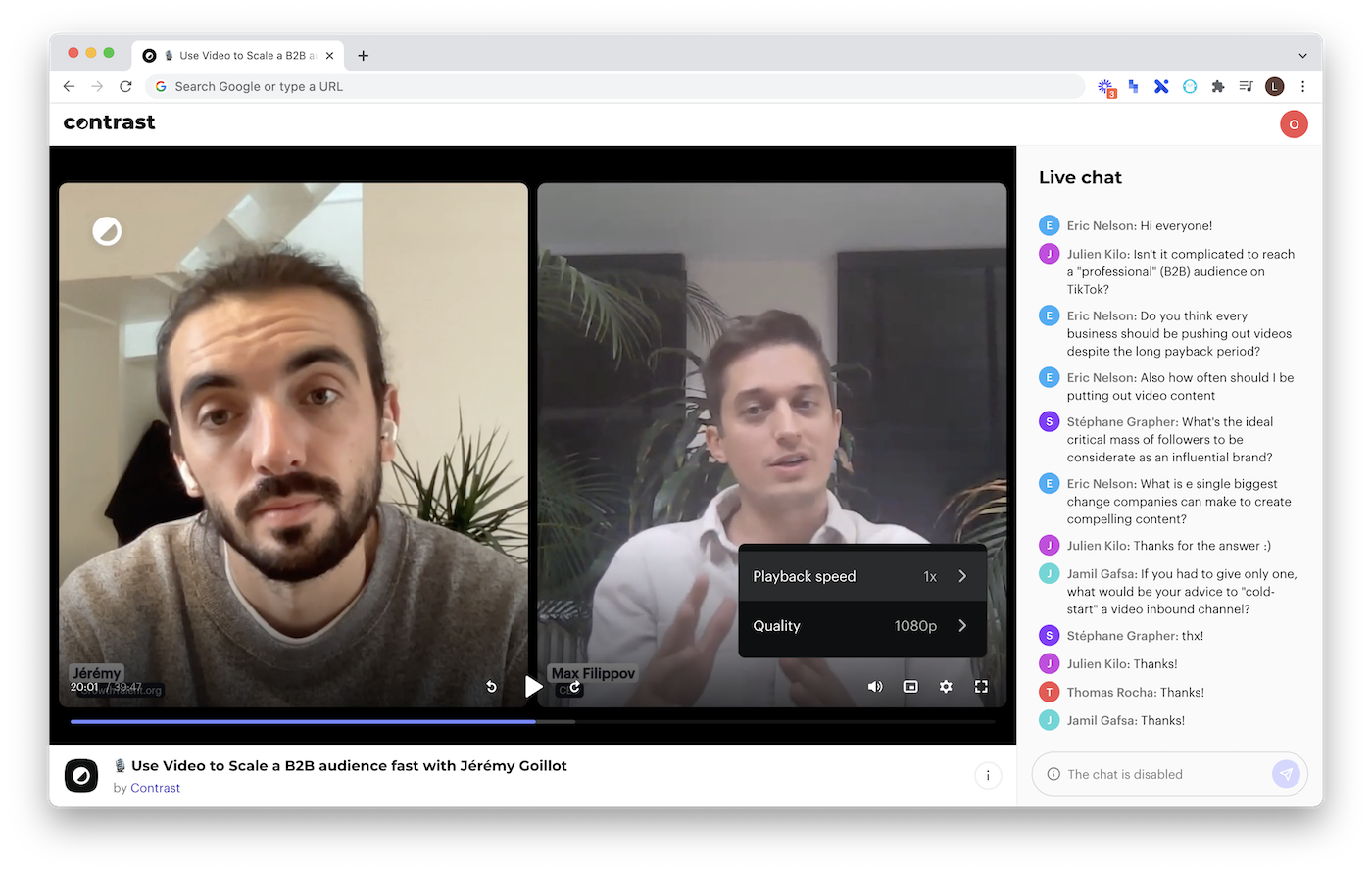
An all new design. She's here, our new player.
We've put a lot of effort in creating a player that was both beautiful and functional.
On top of that, we've added new features, such as playback speed, a quality switcher and a way for people to toggle forward and back.
Finally, we've improved the latency to just 6 seconds. One of the lowest in the market.
👋

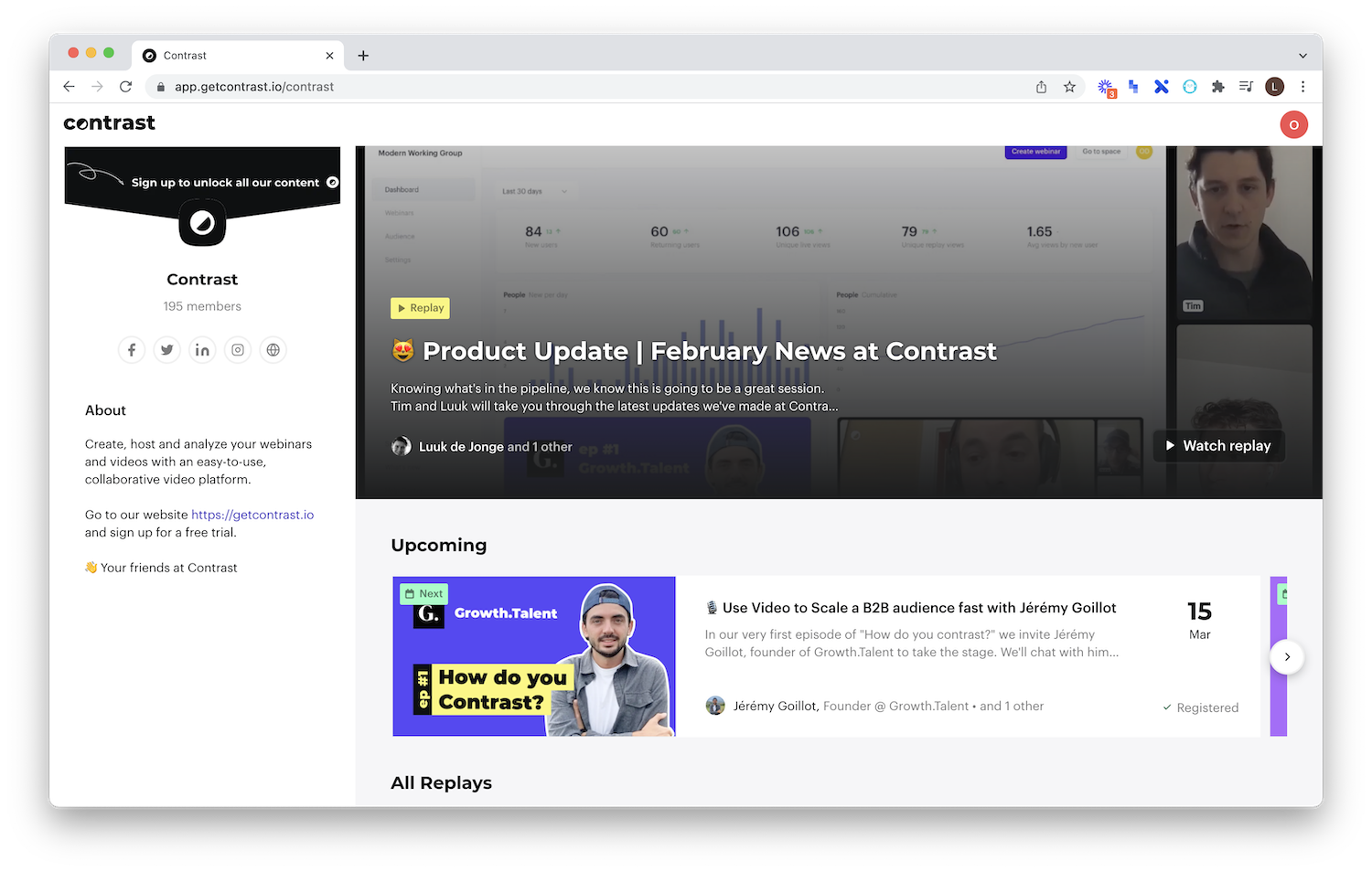
The featured webinar at the top of your Space has always been a great way of getting people to sign up for your webinars. Today, we're replacing the cover image of your webinar with the actual webinar.
Webinars will play automatically but without sound, enticing your viewers to sign up to your content to watch it. Not only will this increase signups, it will also turn your Space into a dynamic and modern experience.
👋
After Google SSO, we've now also implemented Microsoft so that your registrants who use Microsoft can access your content in one click.
👋
On the settings tab you're now able to change your Space URL independently from your Space name.
So that you can make, https://app.getcontrast.io/modern-working-group into https://app.getcontrast.io/mwg
👋

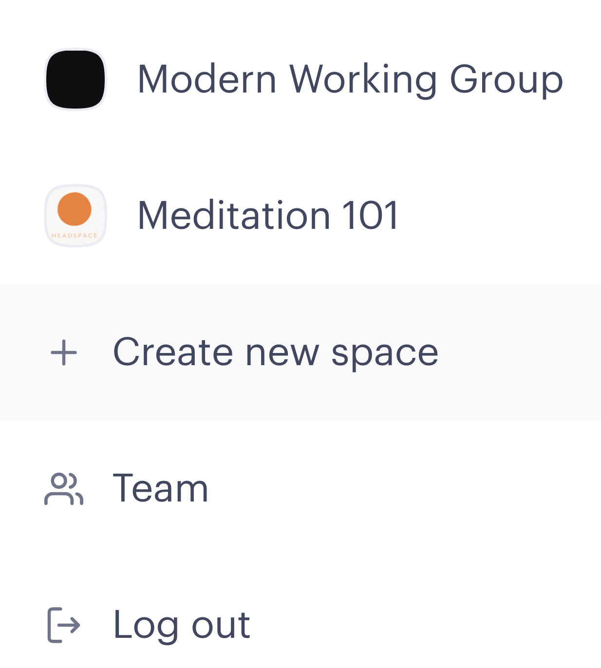
We heard you, you don't want multiple accounts. Today, we introduce the notion of Space, which is a unique group for your webinars.
Click on your profile and create a new Space to get started.
👋
Everyone needs some help every now and then, right?
🔗 Meet our new resource center
Besides general information regarding the organizer side of the platform, we've also added a section for speakers. Send them a link to reduce the chances something will go wrong with streaming. And we all know how tricky streaming can be.
👋