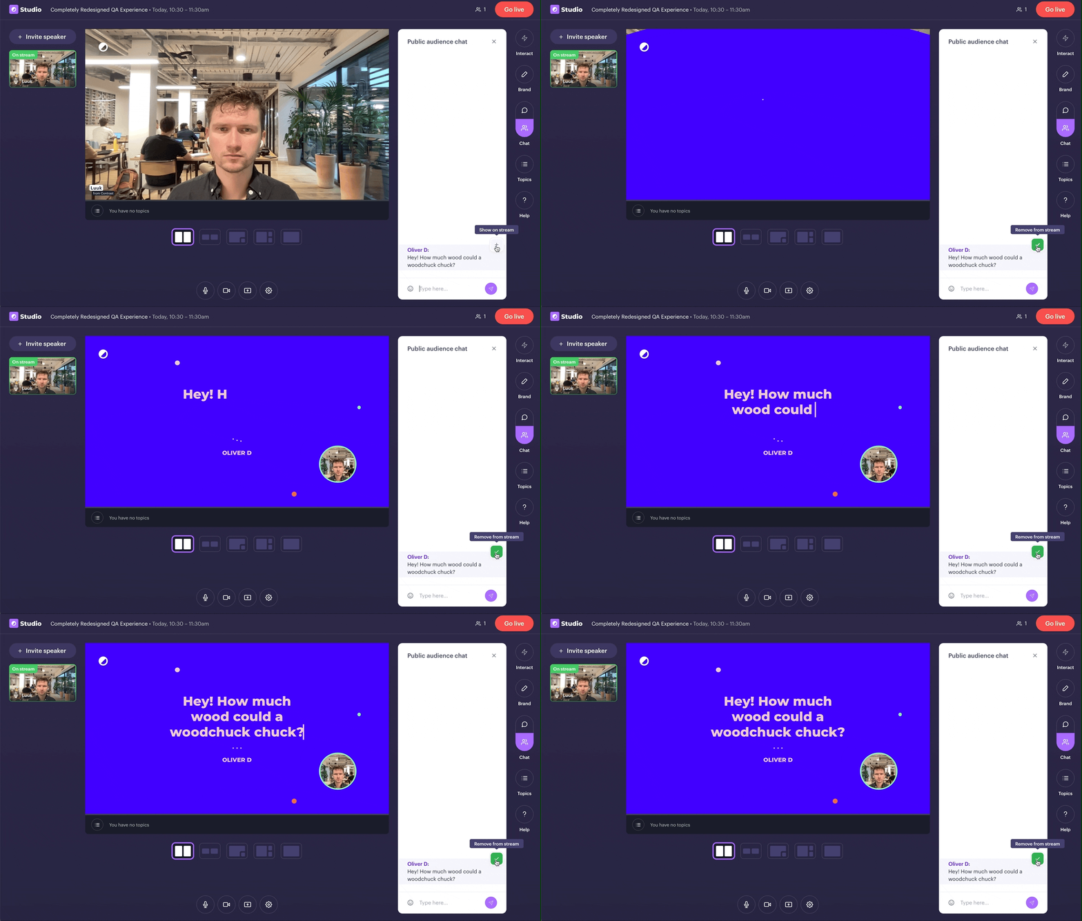
Today, we're taking our QA-feature to the next level. It works like just before. This time though, we take your brand's colors and make questions look like this.
👋 Your friends at Contrast


Today, we're taking our QA-feature to the next level. It works like just before. This time though, we take your brand's colors and make questions look like this.
👋 Your friends at Contrast
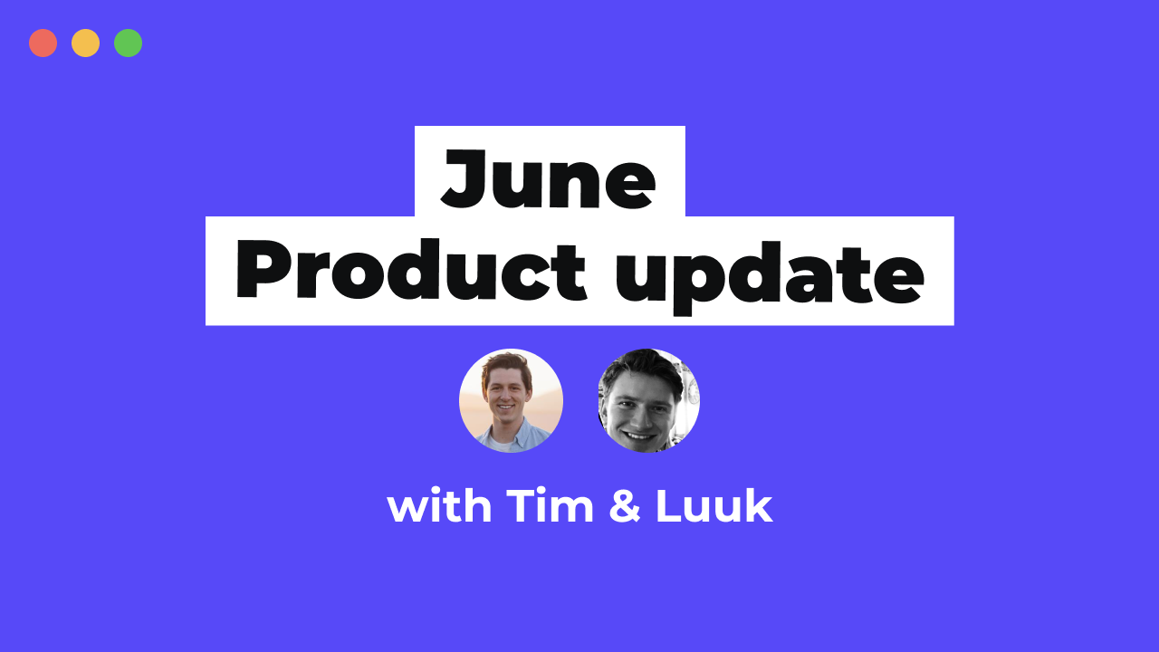
Tim & Luuk will be discussing all the latest updates on Contrast and what's to come next.
👋 Your friends at Contrast

We understand the importance of HubSpot in your stack. That's why we're building the most powerful integration you've seen so far.
We're live and onboarding customers. Reach out to us, and we'll help you get setup.
👋 Your friends at Contrast
Topics are the perfect replacement to ditch your PowerPoint and engage your viewers.
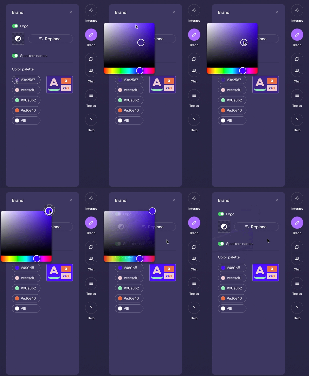
Today, we're making it possible to brand your Topics. Head over to the Studio and select your brand's colors.
👋 Your friends at Contrast
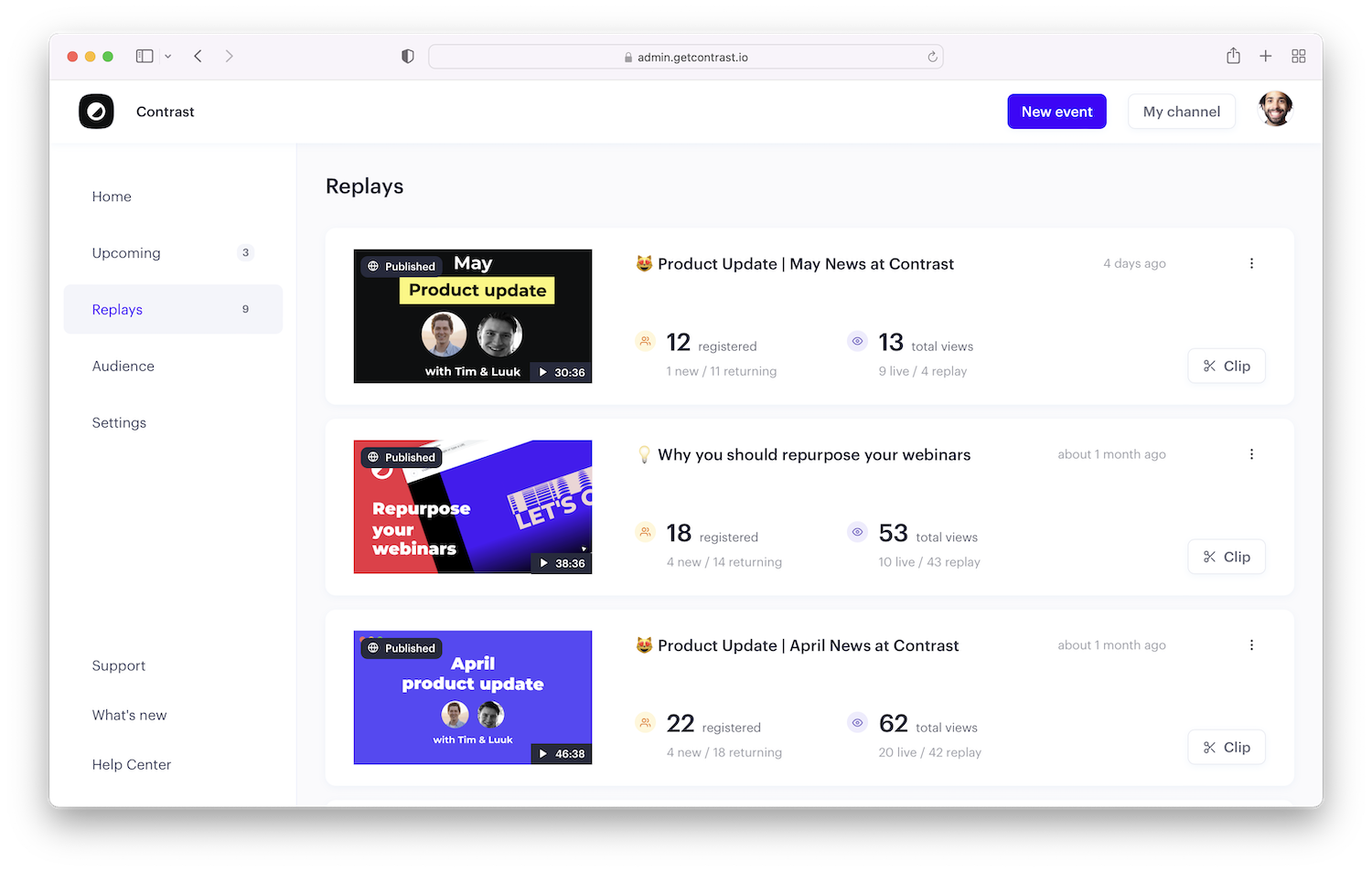
Your replays now have their own place in the app. From here, you access analytics, replay page and of course clipping.
👋 Your friends at Contrast
Tim & Luuk will be discussing all the product updates that we brought to Contrast in the last month.
Today, at 16:00 CEST on this link
👋 Your friends at Contrast
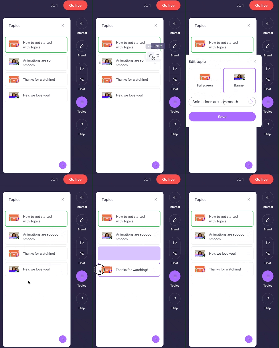
It's now easier than ever to organize your topics. Edit, delete and drag&drop 'm in any way you want.
Before the webinar preferably. Easy enough to do during it in case of emergency ;-)
👋 Your friends at Contrast
It's simply better that way.
👋 Your friends at Contrast
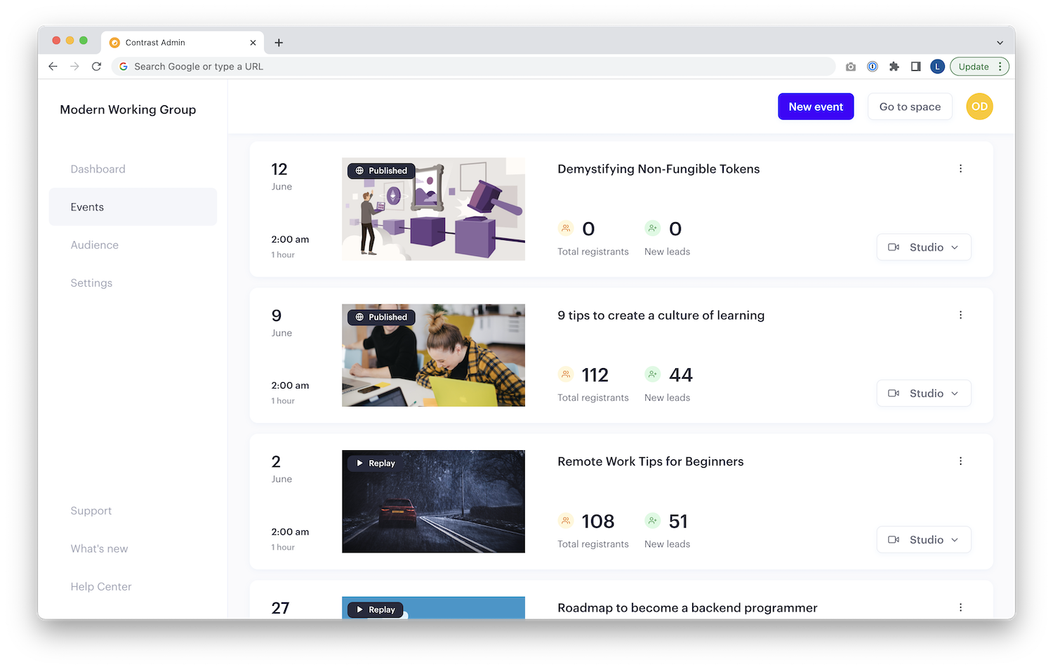
We know.. the events tab wasn't the most beautiful part in the Contrast app. But that has changed today.
On top of that, we've added all the important numbers right on top of it. Oh, and all the actions you use daily are now also accessible from here.
👋 Your friends at Contrast