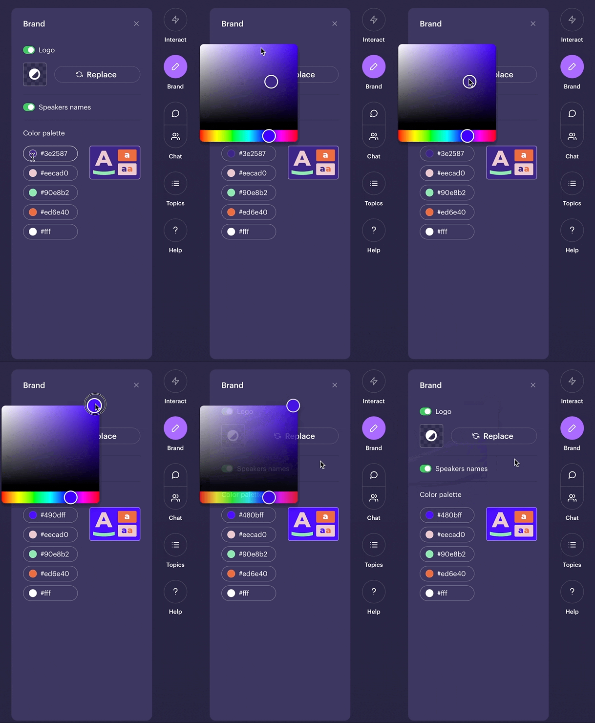
We'll now remember your logo and brand colors so you don't have to fill them out again.
👋 Your friends at Contrast

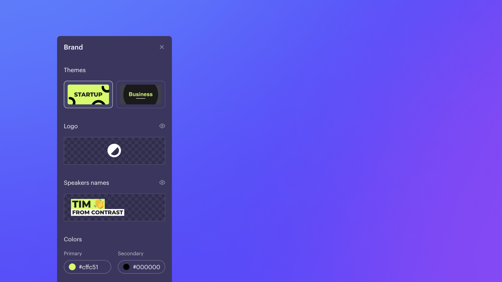
We'll now remember your logo and brand colors so you don't have to fill them out again.
👋 Your friends at Contrast

Oh la la, speaker names in the colors of your brand. And there's a theme too. And another, coming soon.
👋 Your friends at Contrast
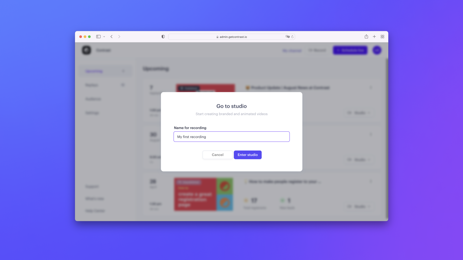
On very popular request. Everything good from the Studio without the webinar.
👋 Your friends at Contrast
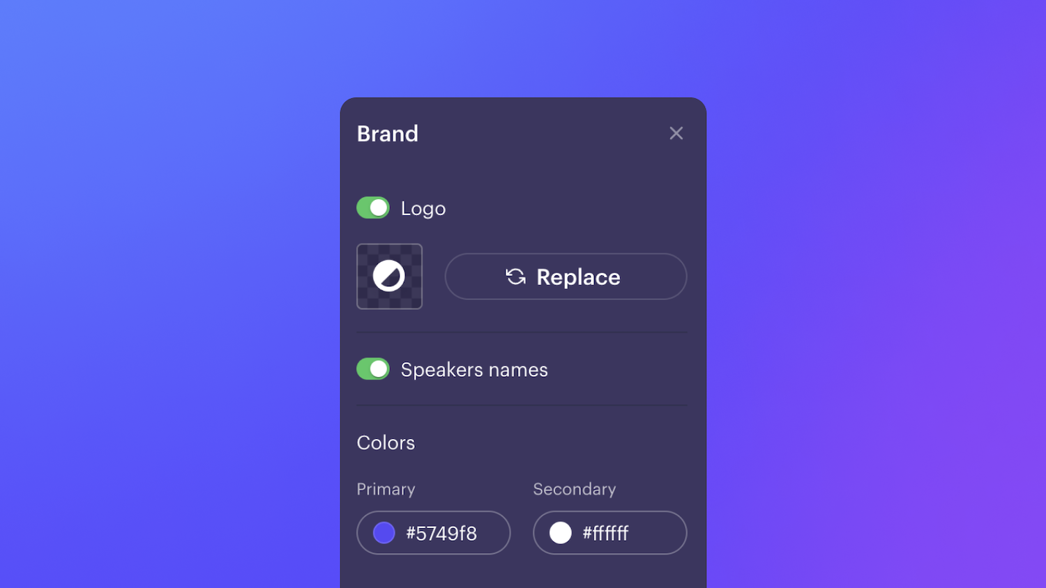
Selecting 5 brand colors was maybe a little much. Now select your 2 main colors and we figure out the rest automagically.
The colors apply to all topics, questions and names.
👋 Your friends at Contrast
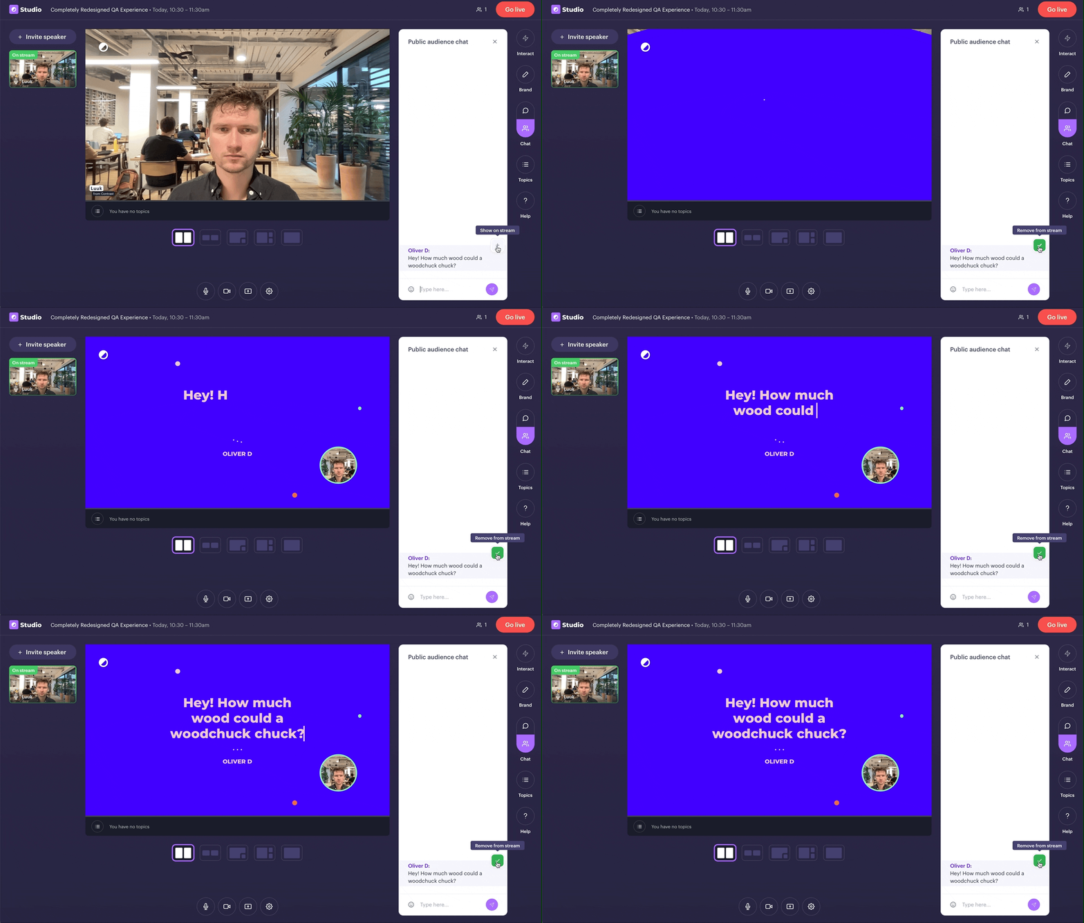
Today, we're taking our QA-feature to the next level. It works like just before. This time though, we take your brand's colors and make questions look like this.
👋 Your friends at Contrast
Topics are the perfect replacement to ditch your PowerPoint and engage your viewers.
Today, we're making it possible to brand your Topics. Head over to the Studio and select your brand's colors.
👋 Your friends at Contrast
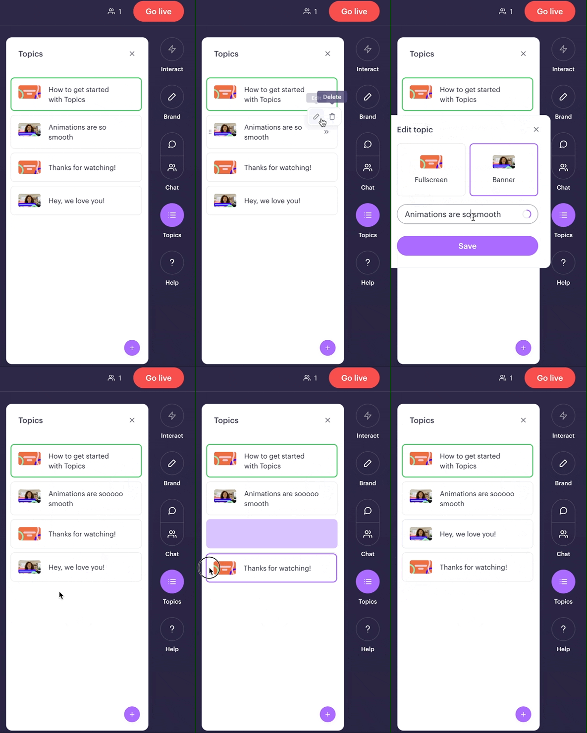
It's now easier than ever to organize your topics. Edit, delete and drag&drop 'm in any way you want.
Before the webinar preferably. Easy enough to do during it in case of emergency ;-)
👋 Your friends at Contrast
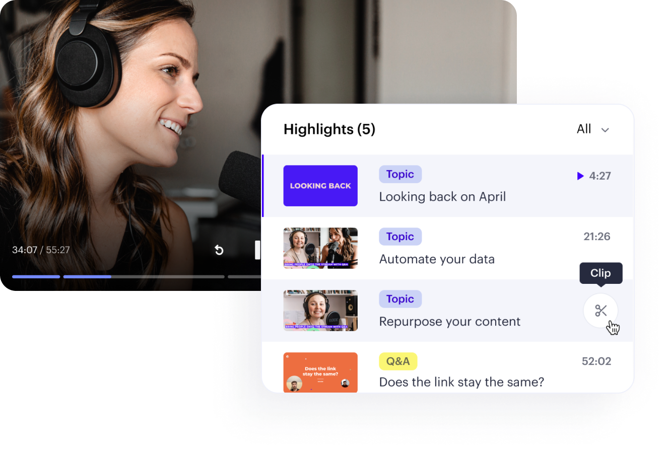
After your webinar, you'll find Topics (and soon Q&A) are saved as your webinar's highlights.
From here, you can clip your highlights into shorter videos. You can use these videos as bite-sized content, or share them on social media.
👋 Your friends at Contrast

The best webinars are conversational and have no slides. The difficulty is managing them and making it easy enough for the audience to follow along.
Topics create an all-new experience. You can create your Topics before going live, they will function as a guideline for your webinar.
On your command, Topics will animate live on stream making it crystal clear what you're talking about.
No more slides.
👋 Your friends at Contrast