Registration pages, webinars and your channel. Make them look and feel exactly like your brand.
Simply select your brand's color in settings and we do the rest.
👋 Your friends at Contrast

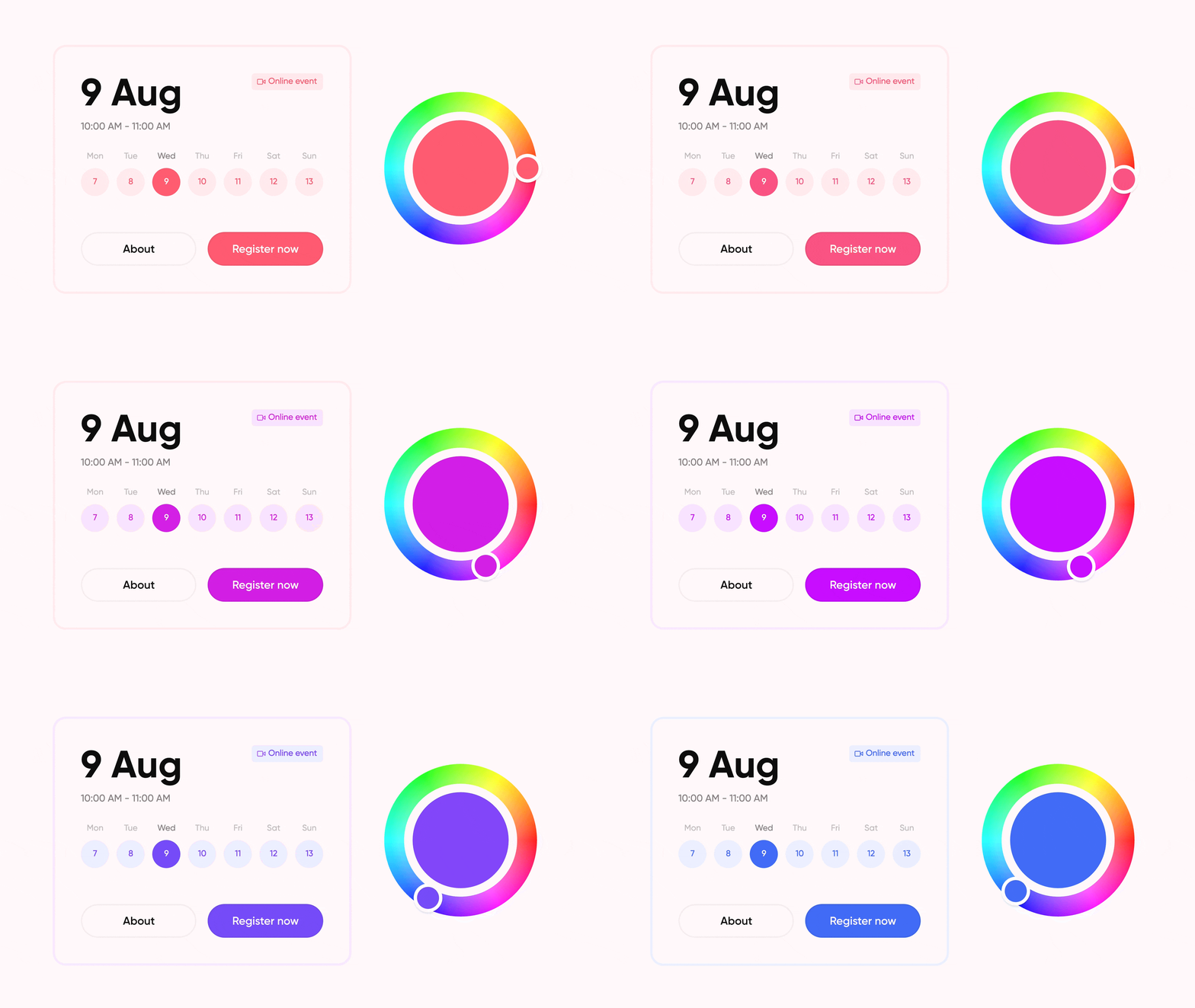
Registration pages, webinars and your channel. Make them look and feel exactly like your brand.
Simply select your brand's color in settings and we do the rest.
👋 Your friends at Contrast
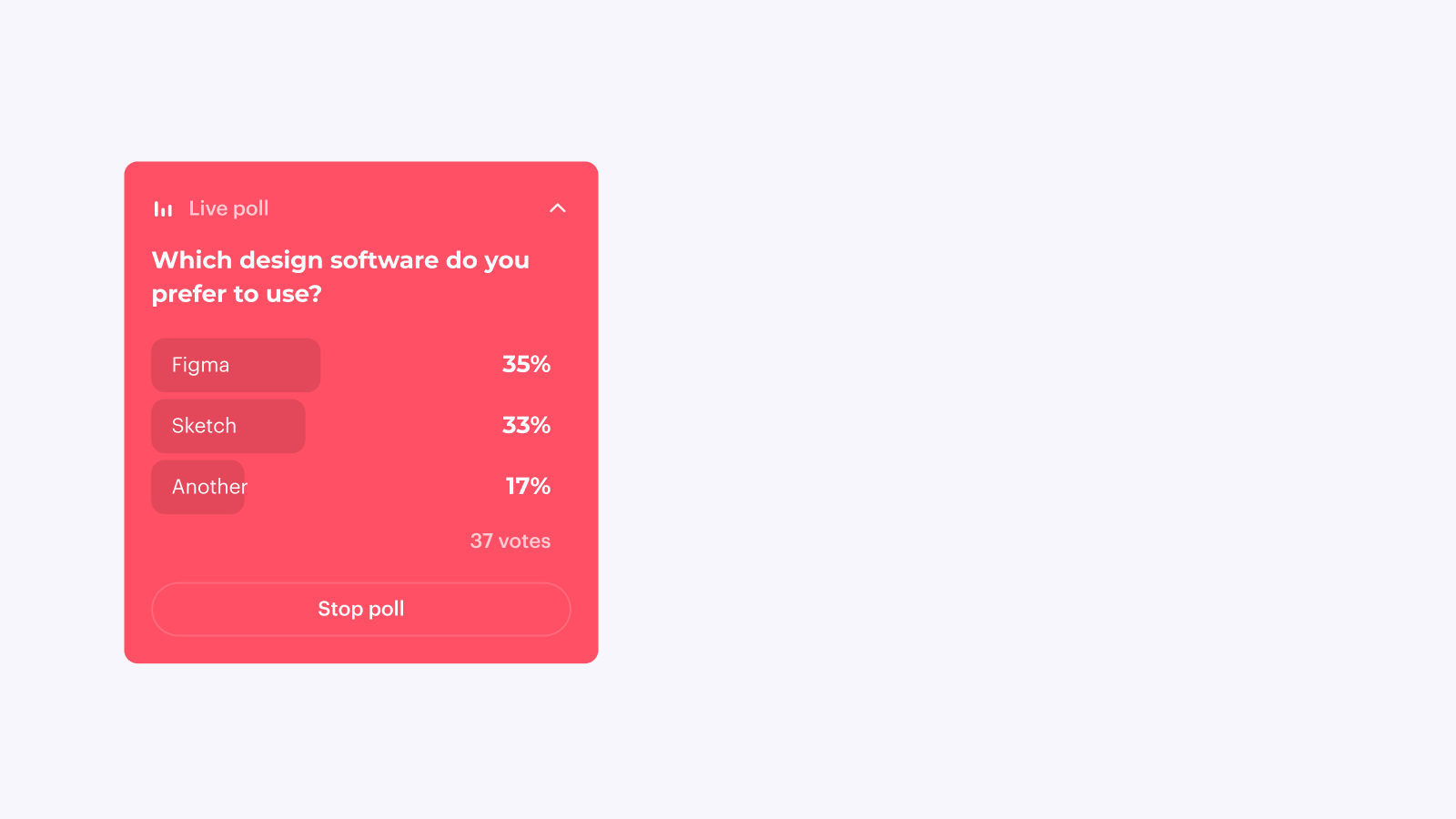
Easily launch polls from the Studio and engage your audience. We push them on top of the chat so that everybody participates.
Soon, they will become part of the video itself as well.
👋 Your friends at Contrast
Contrast is now available in Spanish for your viewers. It works based on people's browser language, so no work on your side.
👋 Your friends at Contrast
Contrast is now available in French for your viewers. It works based on people's browser language, so no work on your side.
👋 Your friends at Contrast
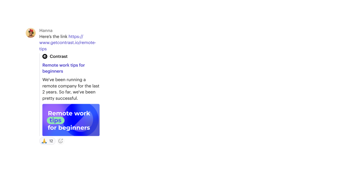
Sharing a link has never looked this great.
👋 Your friends at Contrast
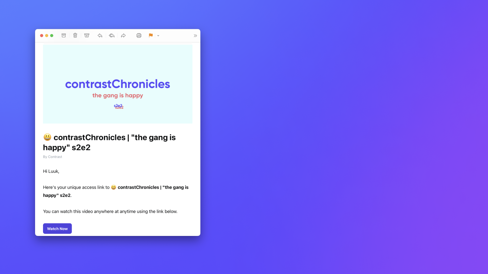
Every email will now contain the webinar's cover image. We changed the sender from Contrast to your name. Finally, you'll also find your socials on the bottom of the page.
👋 Your friends at Contrast

Viewers no longer need to create a password. Instead, registration will work with magic links. The best? They have to sign up just once to access all your content.
👋 Your friends at Contrast