Oh la la, speaker names in the colors of your brand. And there's a theme too. And another, coming soon.
👋 Your friends at Contrast

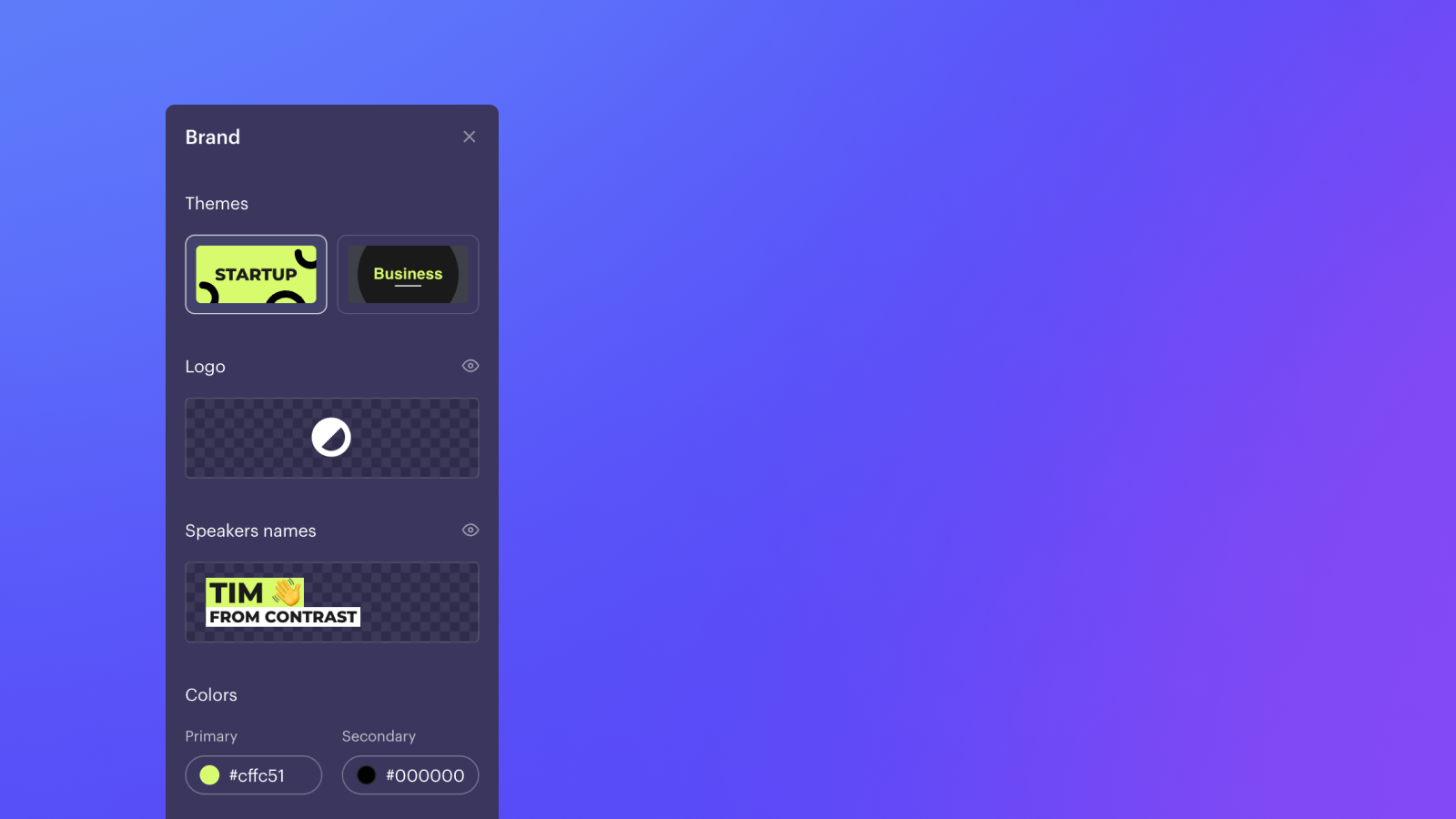
Oh la la, speaker names in the colors of your brand. And there's a theme too. And another, coming soon.
👋 Your friends at Contrast
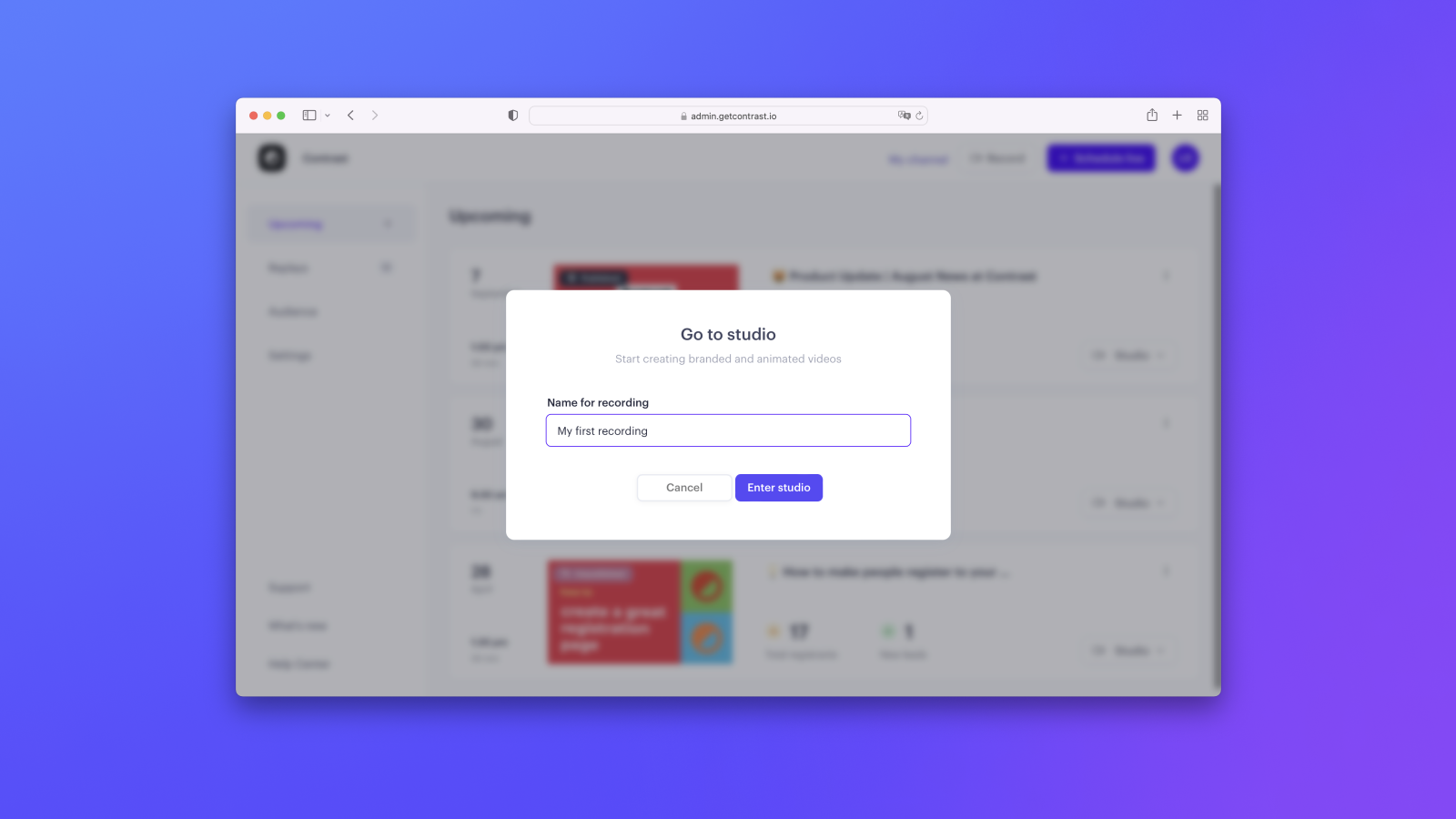
On very popular request. Everything good from the Studio without the webinar.
👋 Your friends at Contrast
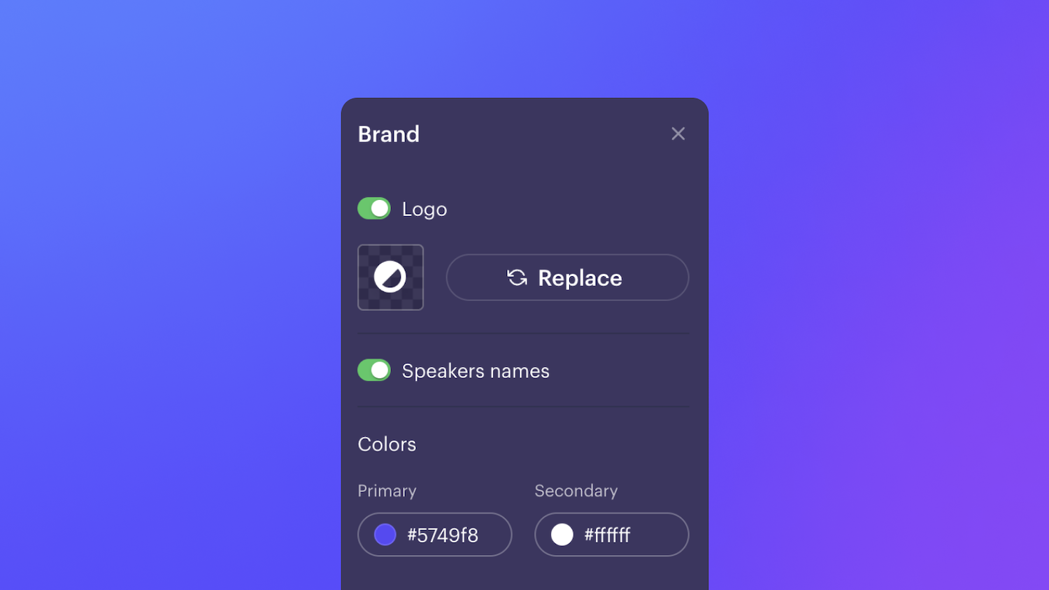
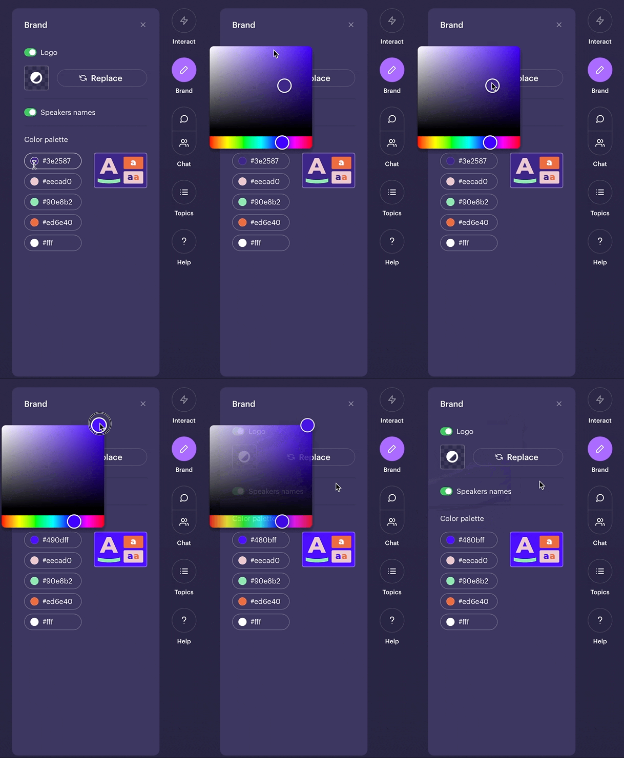
Selecting 5 brand colors was maybe a little much. Now select your 2 main colors and we figure out the rest automagically.
The colors apply to all topics, questions and names.
👋 Your friends at Contrast
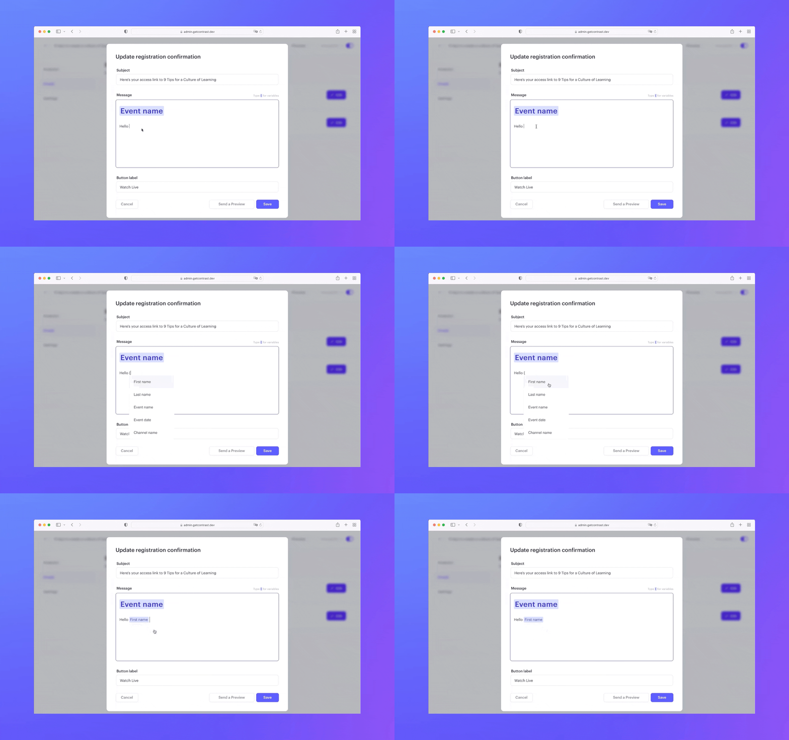
They're here, customizable emails with an easy to use editor and predefined variables such as names, event name and channel name.
👋 Your friends at Contrast
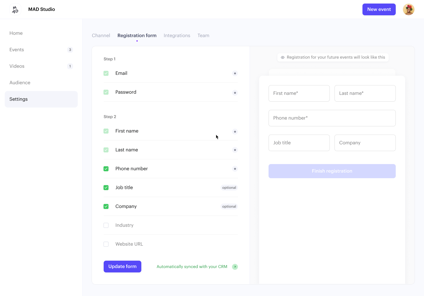
You can now create your custom registration form. It's as easy as selecting one (or more) of the pre-selected fields. They're automatically added to all your webinars.
If you've the HubSpot integration enabled, we'll automatically send this data along with your contact-data.
Read here to learn more about custom data, or how it works with HubSpot.
👋 Your friends at Contrast
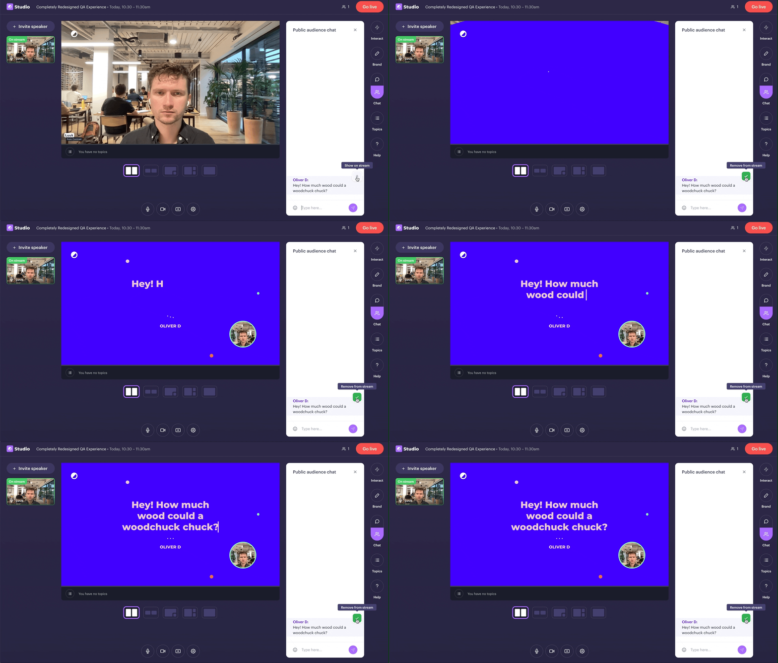
Today, we're taking our QA-feature to the next level. It works like just before. This time though, we take your brand's colors and make questions look like this.
👋 Your friends at Contrast
Topics are the perfect replacement to ditch your PowerPoint and engage your viewers.
Today, we're making it possible to brand your Topics. Head over to the Studio and select your brand's colors.
👋 Your friends at Contrast
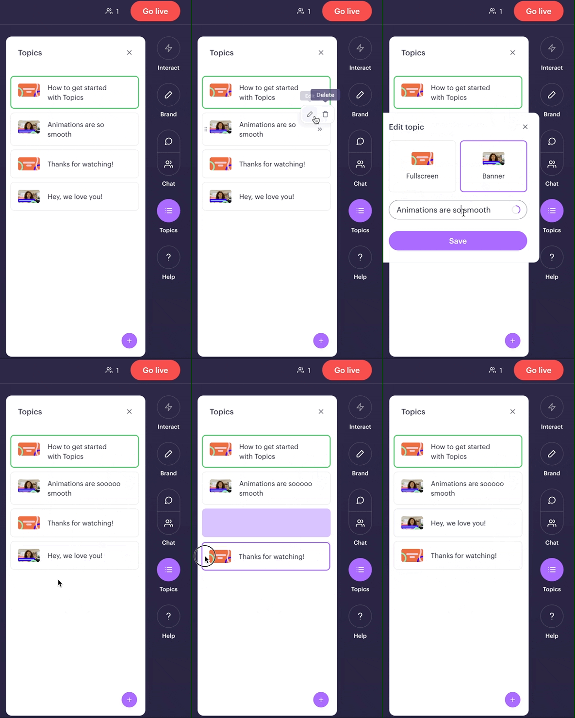
It's now easier than ever to organize your topics. Edit, delete and drag&drop 'm in any way you want.
Before the webinar preferably. Easy enough to do during it in case of emergency ;-)
👋 Your friends at Contrast
It's simply better that way.
👋 Your friends at Contrast